 
  
  Google Ads  browser extension  Usability Booster   
 Are you also annoyed by having to repeatedly click away the same Google Ads recommendations one by one?
Just click on this button and all Google Ads recommendations will be rejected one after the other with “I'll do that later.”
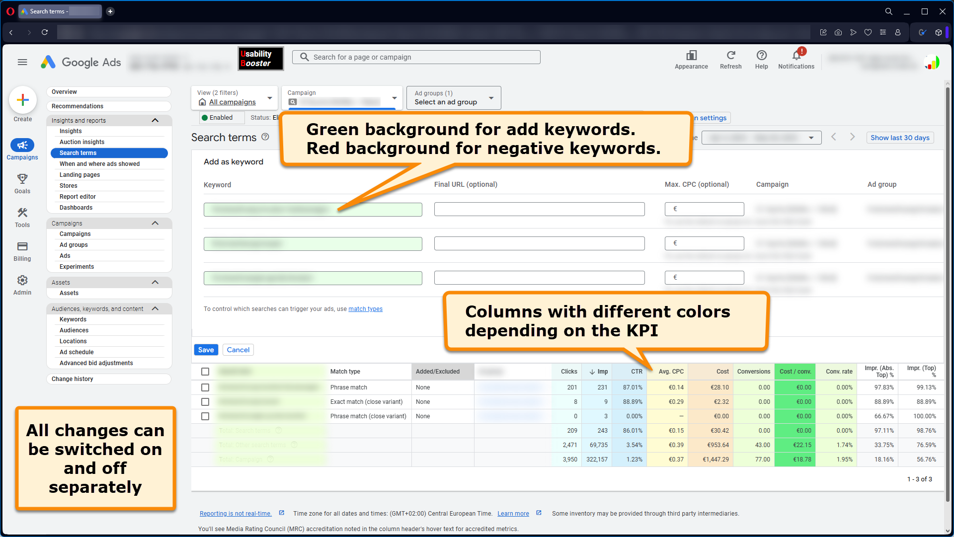
Colors can help avoid mistakes and visually assign numbers in columns to KPIs
 
  
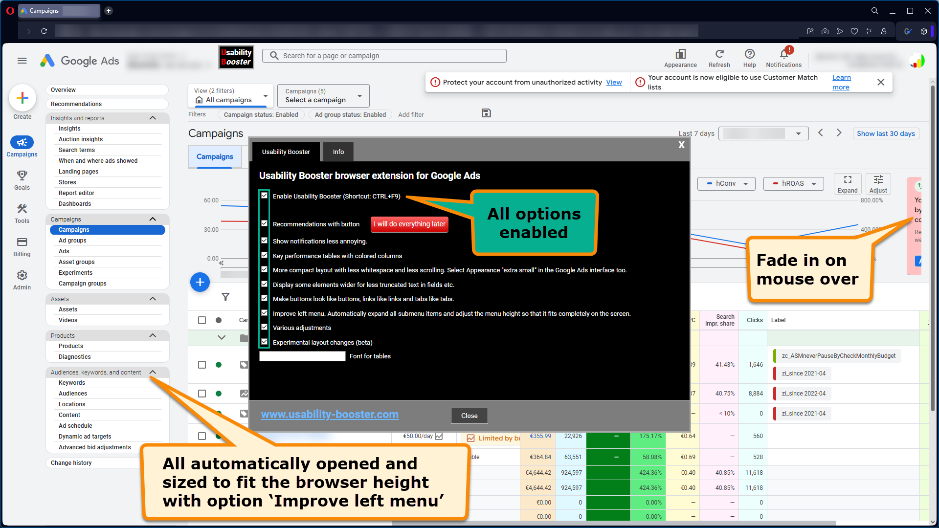
 Usability Booster changes the layout to how it should be
 
  
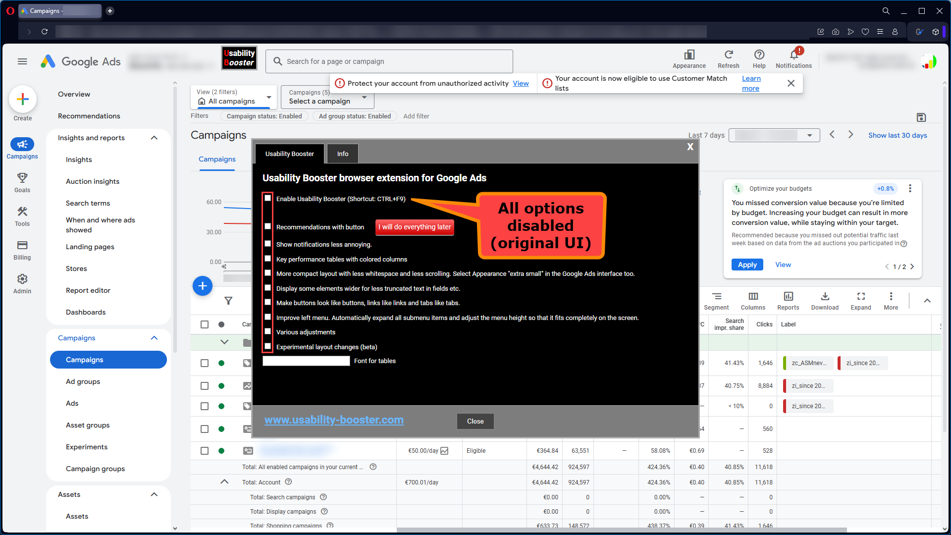
  Options for improving the Google Ads  user interface
  Everyone has different preferences. For some, design is more important, for others it's usability. Some find colors distracting, others find them helpful. That's why you can 
 TIP: Enable and disable options while the configuration menu is open. You will then immediately see in the background what effect an option has on this page.
 The link to the menu is displayed when you hover your mouse over the new 
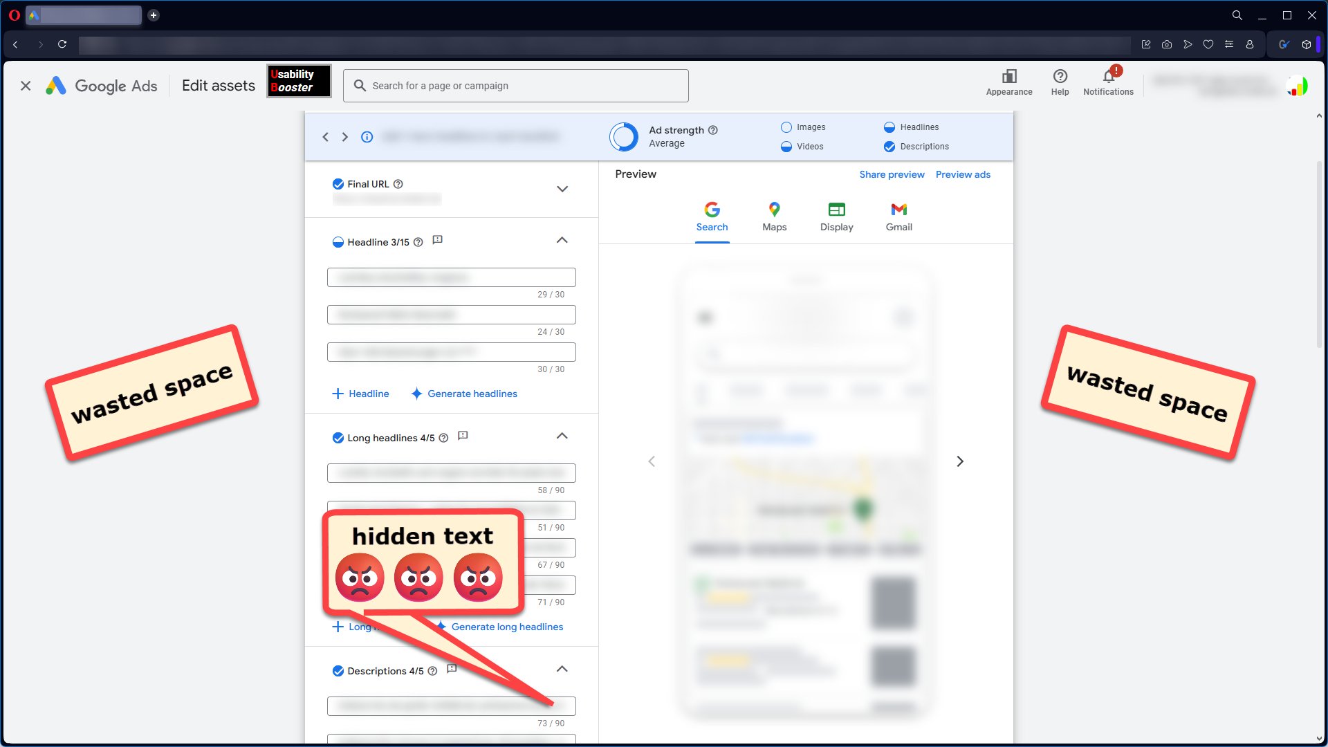
- Recommendations with button I will do everything later
 Are you also annoyed by having to click away the same recommendations over and over again because they don't make sense, would be counterproductive, or the customer simply doesn't give permission for them? One click on the button and all recommendations will be rejected with the setting"I'll do this later" .
 Is there anyone who hasn't missed this button yet? :-)
- Display notifications less intrusively
 - Google displays some messages at the top of a box above the page content. 
 However, these messages partially cover the selection boxes for campaigns and ad groups. Depending on the screen size, activating this option moves this box so that it isless – and on wide screens, it isno longer – a distraction.
- Recommendations for Google Ads are also sometimes displayed to the right of charts. These recommendations are not completely removed, but compressed to a few pixels wide and highlighted with a red background so that you can see that there is a recommendation (see screenshot above). To view the recommendation, simply hover your mouse over the red area.
 
- Google displays some messages at the top of a box above the page content. 
- Colored tables with key figures
 A different background color is used depending on the column, such as CPC, clicks, costs/conversions. This allows you to seeimmediately – without looking at thecolumn header – what the cell content is. 
- More compact layout with less white space and less scrolling
 This option is about putting morecontent – especially moretable rows – on the screen. This setting is alsoa matter of taste :-) 
- Display elements wider so that text in fields etc. is less likely to be cut off
 I find it completely incomprehensible why Google makes the boxes for editing ads orPerformance Max Assets so narrow that the content of the input fields is often cut off(see screenshot above). I'm sure none of the developers of the Google Ads interface have to work with it, otherwise it would look different! But with theUsability Booster , I try to eliminate the biggest layout sins that often hinder productivity.
- Font for key figures
 I find the numbers in the tables difficult to read.
 Here you can enter your favorite font if you are also unhappy with the Google font.Arial, Verdana, monospace ... 
 My current setting: JetBrains Mono SemiBold (Download)
 But maybe only programmers are happy with monospace fonts :-)
- Improve left menu
 In my opinion, this is one of the best features of theUsability Booster . How many times a day do you click on menu items to make the submenu items visible? It's especially annoying when the "Asset" menu only has one submenu item called "Asset." And once you've expanded all the menu items, you have to scroll to see the lower menu items:-( 
 This option has two functions:- All menus are expanded automatically.
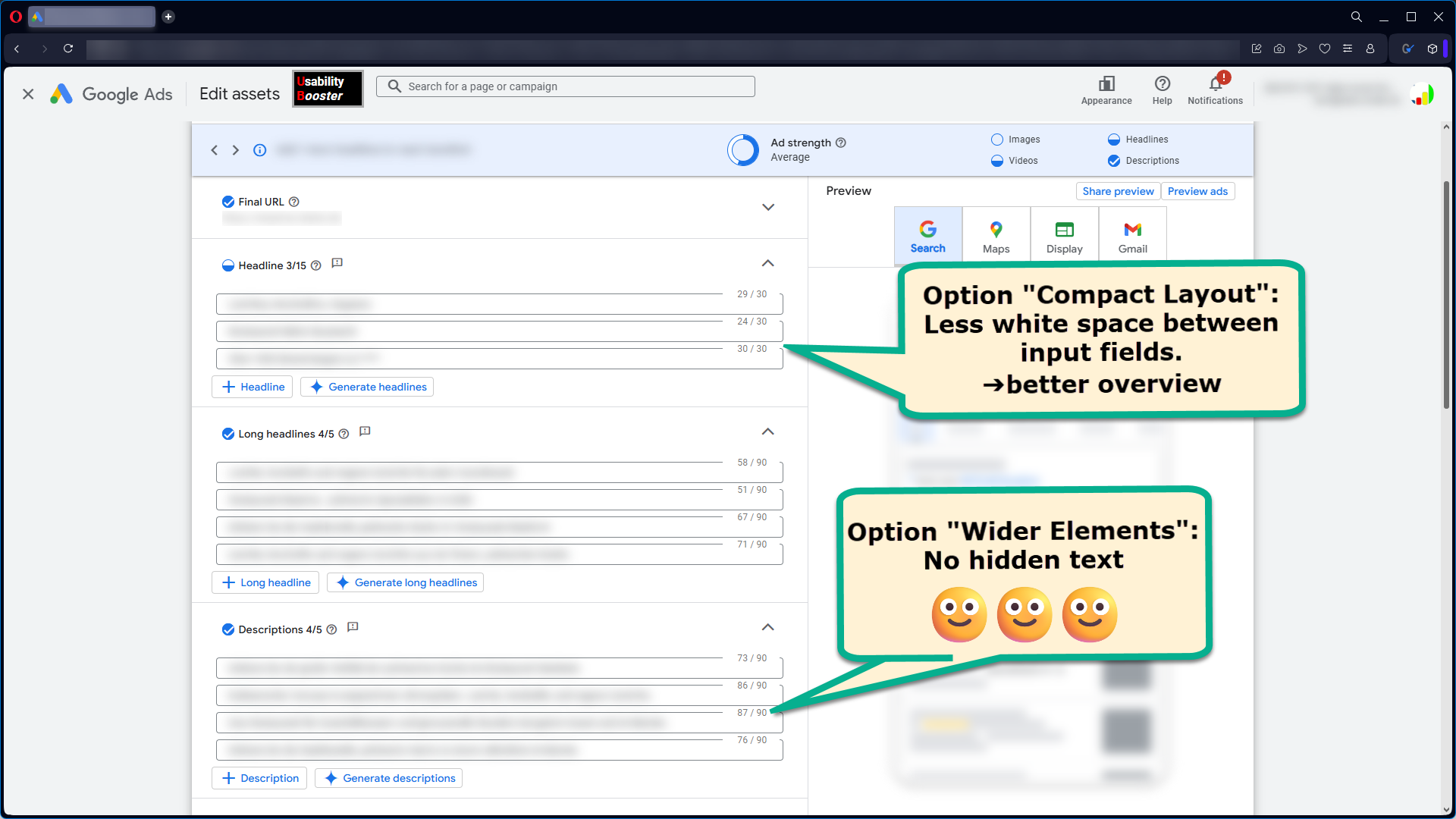
- The height of the menu adapts to the browser height so that all menu items are visible without having to scroll. The display is only as compact as in the screenshot above on small screens. 
 Currently, pale gray lines separate the menu items from each other. Would you prefer with or without the dividing lines?
 
- Buttons look like buttons, links look like links, and menu tabs look like menu tabs
 Designer or pragmatist? I studied civil engineering and believe that"form follows function":-) 
 In some cases, text appears in the same place in the Google Ads interface, sometimes as plain text and sometimes as a link. A link is a link if it behaves like a link and is recognizable as a link. Otherwise, they are Easter egg links and, in my opinion, a design sin. In my opinion, menu tabs should also be recognizable. Here's what it looks like with and without the option enabled:
   
- Various adjustments
 - Label names are no longer truncated after a few characters. In over 20 years ofGoogle Ads optimization , I have of course never accidentally entered excluding keywords instead of keywords in a customer account:-) 
- Some buttons have been moved to the left. On wide screens, for example, the information text is now on the far left and the buttons are on the far right, outside the field of view.
 
- Label names are no longer truncated after a few characters. In over 
- Experimental
 Currently, some status messages in tables are no longer wrapped to x lines when the column is too narrow (normal case). With this option, if you have also activated the more compact layout, only as much of the message is displayed as the column width allows. If you move the mouse over the message, everything is displayed. This often allows many more table rows to fit on one screen.
Manche Anpassungen sind nur auf größeren Monitoren aktiv, um Darstellungsfehler zu vermeiden.
Usability Booster Download
 Google Ads is a living system! Google is constantly making changes that are rolled out gradually. The changes may be visible or may only affect the 
 The 
 
 Please let us know if you encounter any problems so that they can be resolved quickly. 
 
 Contact
 Information about updates:
 https://www.linkedin.com/in/holgerschulzdatainside/
 
 Please send questions, feedback, feature requests, and bug reports to: service@usability-booster.com
 
Guaranteed no data transfer
- To make changes to websites with the URL https://ads.google.com/... .
- To permanently save your selected options in the browser.
 The Usability Booster browser extension only improves the Google Ads web interface. The browser extension does not request any permissions for URLs other than 
 Browser extensions are checked by Firefox/Mozilla and Chrome/Google before publication to ensure that extensions do not send data without requesting permission from the user.
 In addition to our guarantee that our browser extension does not read or send any data from Google Ads, Firefox/Mozilla and Chrome/Google also check our Usability Booster browser extension. If the Usability Booster is extended to other websites such as Merchant Center, you will receive a message in your browser and must explicitly agree to the newly requested permissions. 
Terms of Use
 Usability Booster modifies the content of the 
The use of our browser extensions is at your own risk. Liability for damages caused by simple negligence is excluded to the extent permitted by law. Liability for intent, gross negligence, or breach of essential obligations remains unaffected.